When you click on links to various merchants on this site and make a purchase, this can result in this site earning a commission. Affiliate programs and affiliations include, but are not limited to, the eBay Partner Network.
The CORRECT 2nd Style 1970 Tire Pressure Decal Available From Ray Derise - CO Member
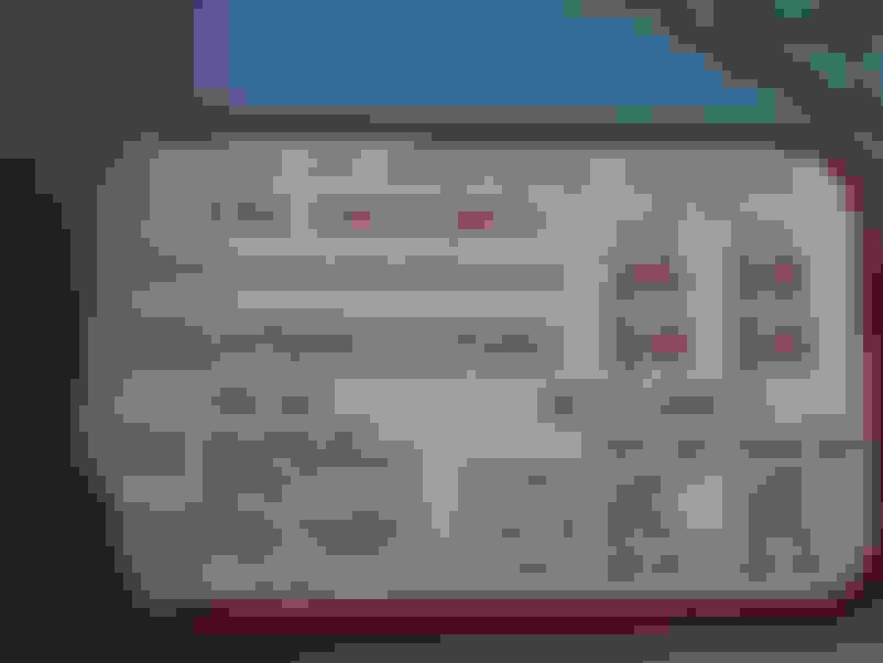
As I've been doing my W-30 resto, I've been amazed at how many repro parts are close, but not correct. The maddening thing is the little details that are wrong could be easily solved if someone would take the time. An example of this is the repro tire pressure sticker I bought. My car is a Jan production so it needs the second style '70 sticker - Type "OB" At first glance it looks OK, but when I compared it to my original several things were wrong:
1) No dashes in between the 4-4-2 at the top
2) No parenthesis around the "455 V-8 Engine" and Engine should have only the first letter capitalized
3) Font too fat on the tire pressure numbers
4) font too small on "PSI Cold"
5) "VEHICLE CAPACITY" too far right
6) "OB" spacing too narrow
7) Fonts in general too heavy or thick on the smaller letters.
Recently, Ray had to make a correct early style tire pressure sticker for his car (Nov 69 build) himself since no one reproduces it at all. It came out looking so nice I asked him if he would consider making the later style sticker. He gladly said yes - and the results speak for themselves in the pictures below. One is a comparison of the Dr. Decal sticker to Ray's reproduction, and the other is a pic of my original sticker. If you are doing a Dec 69 and later 70 and want to get it right - contact Ray - his CO handle is ndedrise.
And no I am not getting commission on this - I just thought the work was that good and everyone should know about it!
Last edited by costpenn; Mar 12, 2015 at 10:55 AM.
thanks for your kind words of approval Joe. if anyone needs these tags for 1970 are another one made please P M me and I will see what I can do for u.
thanks ray
I realize this is an old thread, but since you resurrected it, I have to point out a few things. Not to be an @$$ (well, no more than normal), but the new decal, while better, still doesn't match the original. The font used in the top row has the wrong aspect ratio. The "2" and "6" in 26 are different from original. The font in "TIRE PRESSURES" isn't quite right either. The "407884" in the bottom left is in the wrong position and also not quite the right font. The "O" in the red "(OB)" doesn't quite have the correct shape, either. The "1"s are all incorrect also, as they don't have the serif on the bottom.
I realize this is difficult to do when trying to match up current fonts with those old ones, but it's still only close, not exactly correct.
If there is a better one out there I suggest it be bought this is not a photo copy of the original but a time consuming recreation on a computer program that a friend asked me to reproduce for him. My I suggest that u take the time to pick apart the dr decal version as u did mine, in all fairness to me. I have had nothing but good reply's on the tags and have the only early 70 ones to be found.
If there is a better one out there I suggest it be bought this is not a photo copy of the original but a time consuming recreation on a computer program that a friend asked me to reproduce for him. My I suggest that u take the time to pick apart the dr decal version as u did mine, in all fairness to me. I have had nothing but good reply's on the tags and have the only early 70 ones to be found.
As I pointed out in my previous post, this repro is clearly better than the other one. Unfortunately, it still isn't quite correct. As I also pointed out above, I understand the difficulties in working with modern fonts vs. old ones. Unfortunately, the original post in this thread made the statement:
The maddening thing is the little details that are wrong could be easily solved if someone would take the time.
I could tear it apart further but that would be rude and unproductive. I applaud just about anyone that gives it the old college try. Newer programs are a little difficult to get the spacing correct and font differences will change spacing I know this all too well. Even creating font by hand in the program is a real bitch to make everything line up.
I could tear it apart further but that would be rude and unproductive. I applaud just about anyone that gives it the old college try. Newer programs are a little difficult to get the spacing correct and font differences will change spacing I know this all too well. Even creating font by hand in the program is a real bitch to make everything line up.
U r so correct
I was well aware for all he pointed out and more as u said


 The CORRECT 2nd Style 1970 Tire Pressure Decal Available From Ray Derise - CO Member